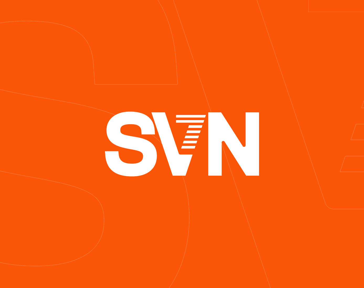
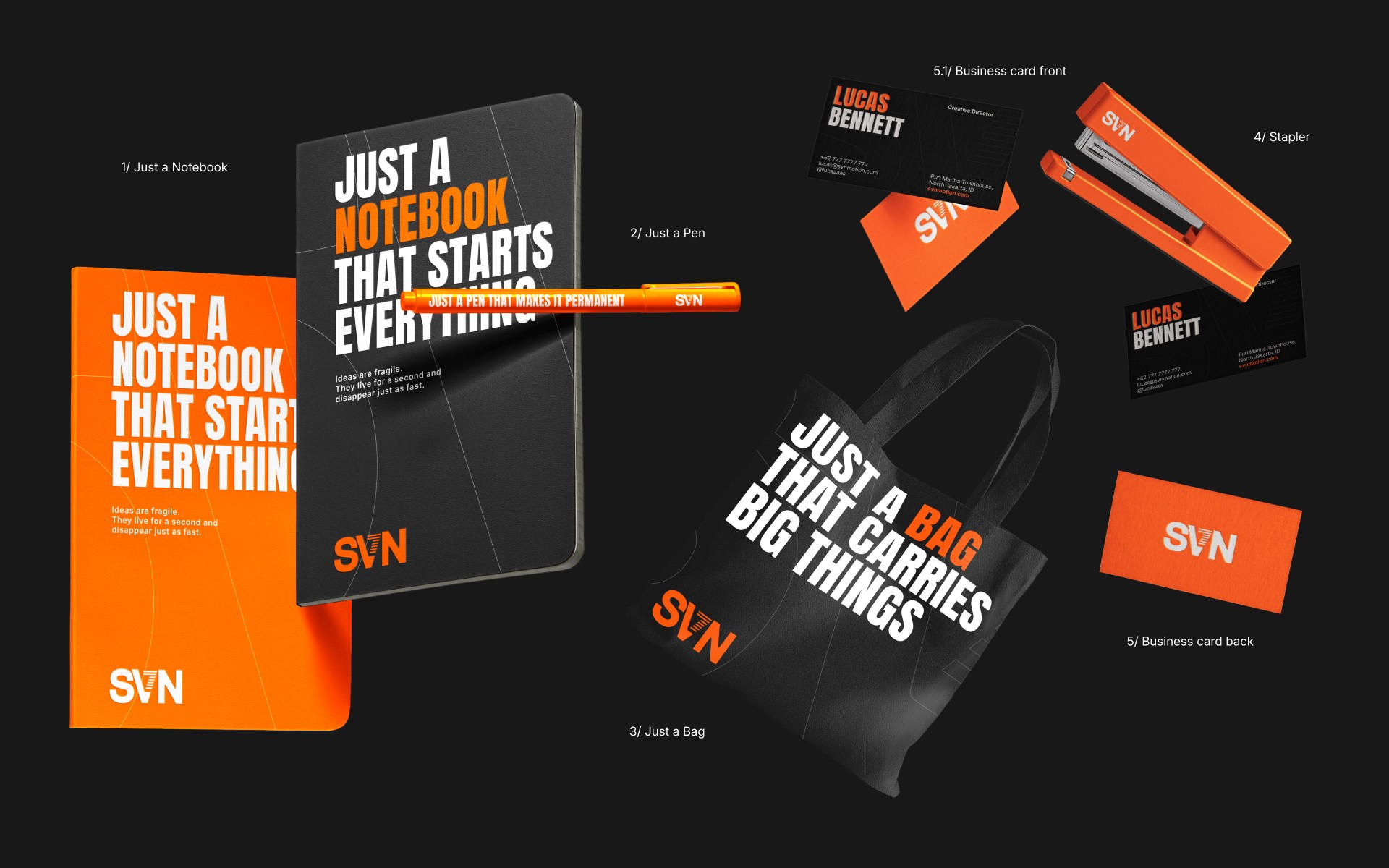
SVN Motion is a Jakarta-based creative production house specializing in powerful, story-driven visual content. From high-impact commercial ads and digital content to corporate profiles, video campaigns, and cutting-edge 3D services — SVN Motion is dedicated to helping brands communicate with clarity, creativity, and confidence. As part of its brand evolution, SVN Motion has unveiled a fresh new logotype that reflects the company’s energy and forward motion. The visual identity is built around the abbreviation SVN, short for SEVEN — a name that symbolizes completeness, movement, and vision.
At the heart of the logo is a reimagined “V” shaped as the number 7, subtly integrated into the negative space of the wordmark. The seven parallel lines cutting through the “7” are a deliberate design choice — not only do they enhance the sense of motion, and direction, but they also represent the word SEVEN in a visual form. This smart typographic twist reinforces the brand's identity and creates a strong symbolic link between the name and the logo.
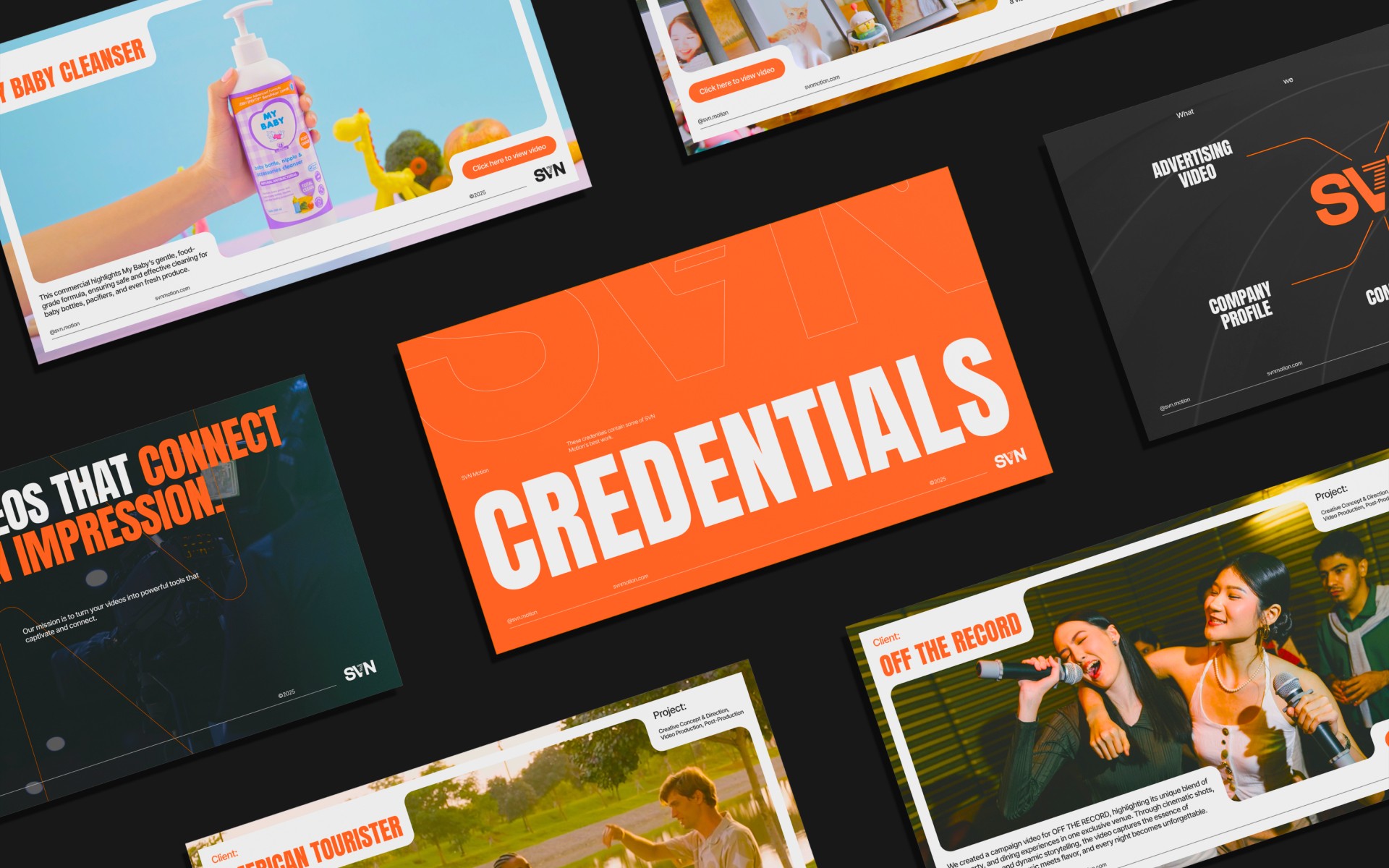
To support the overall brand communication, I also designed a credentials deck - a digital document showcasing SVN Motion's best work in video campaigns, TVCs, and company profiles. The design incorporates a clean layout, concise information structure and strong visual hierarchy, ensuring each piece of content is easy to navigate.